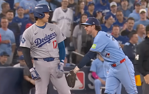
Is this a picture of a good pitcher?
What those pitch movement charts can mean to you

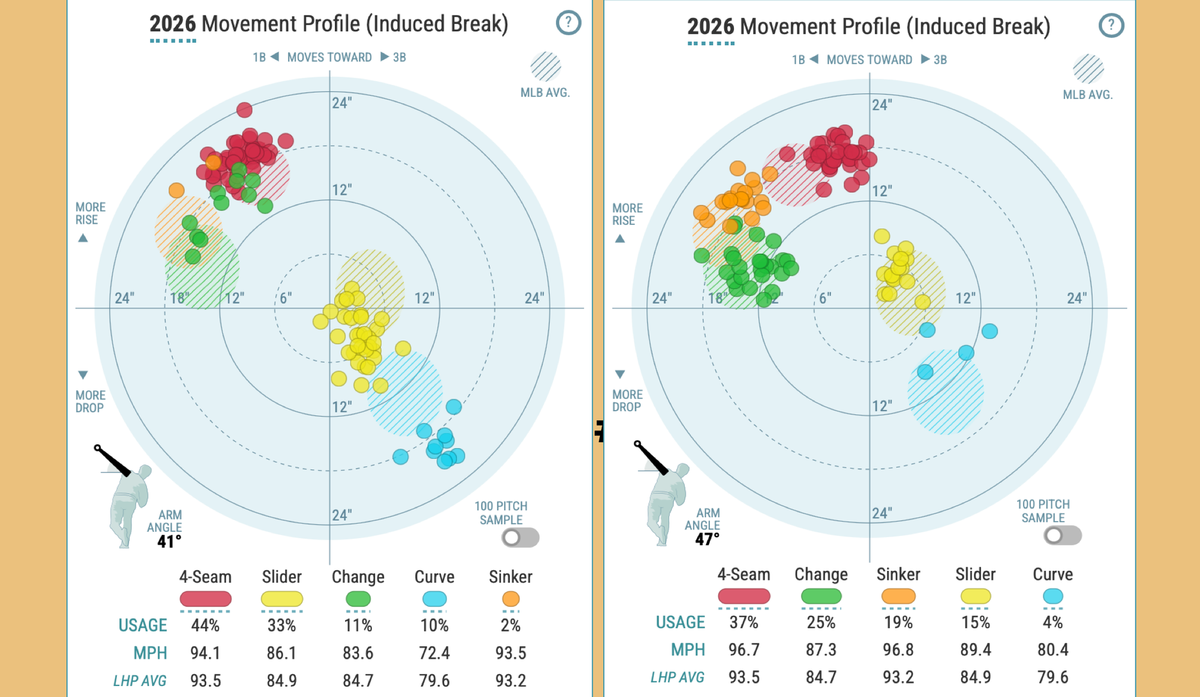
First you see the bold colorful dots. Dots of the same hue stick together, clustered in and around fainter, similarly-shaded clouds of territory, little uniformed armies of varying size. The dots and clouds are plotted around a circular backdrop with axes intersecting in the center, something like a stripped down dartboard, perhaps, or a radar. The far-flung dots suggest that hitting the bullseye is probably not the object of the game. Maybe a hotly contested region, no man’s land.
Sometimes a little arm extends from the center point at an angle, like a speedometer. And then, below the graph, lines of data with actual velocity readings and labels. They match the color of the dots to what they actually signify: types of pitches. One pitcher’s arsenal, like a fingerprint developing over the course of a season.
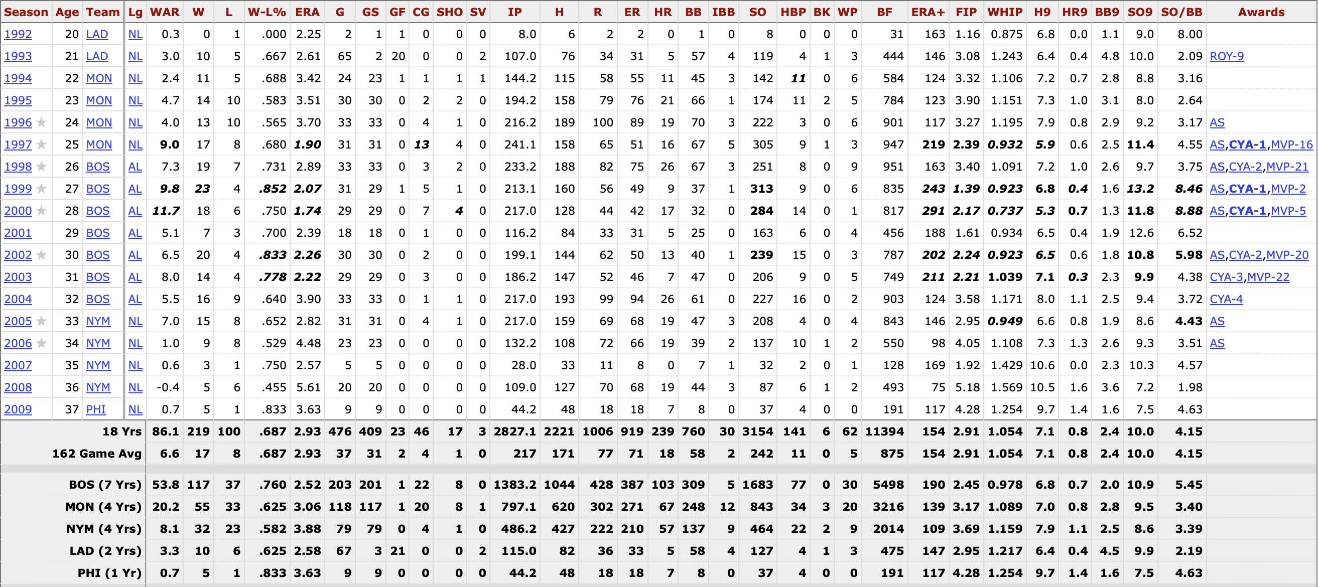
Baseball's longest running obsession is collecting, storing and displaying information. People behind walls in the ballparks relayed the line score. Fans in the stands expounded upon it, scribbling coded details in scorebooks. Box scores in newspapers distributed the day-by-day results. Baseball cards commodified them, creating art for collectors who had to weather math class before they could get back to negotiating at recess. On and on, time and technology have updated the methods. The player pages at Baseball-Reference are the modern touchstone. Data — collected, stored and displayed in a familiar form — becomes identifiable and meaningful on its own.
New layers of information beget new visual renderings of the action, games and players. Over the past 18 years, and especially the past decade with MLB’s Statcast system, our ability to track the movement of the ball has spawned a ton of new forms of data, exit velocity being the one that has most fully integrated itself into the broader fabric of watching the game.
Following baseball now means seeing pitch type graphics on TV, at a minimum. If you’re taking your fandom online at all, it probably means exposure to the Baseball Savant bubbles and eventually, the dartboard/radar/dot thing, which is a pitch movement chart.
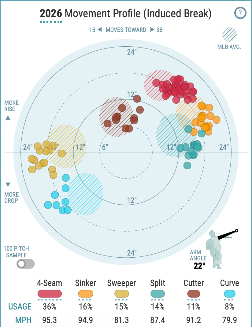
If it doesn’t look like anything to you, there’s a good reason why. The format presents a real information age challenge to the learning curve that bends toward identifiable and meaningful.
Where box scores and Baseball-Reference pages gave accountings of the results, these charts (and a variety of offshoots using this new data) are meant to relay not how a pitcher did, but how he does what he does.
⚾️⚾️⚾️
When he was a boy in late 1800s Switzerland, Hermann Rorschach liked to “collect inkblot cards that could be bought from local shops and make associations and stories from the inkblots.” Known as Klecksography, this little pastime earned him the nickname Kleck in high school and eventually inspired a professional idea that inserted his name into the lexicon.
The Rorschach test is a psychological assessment where a person is shown 10 inkblots. The trained observer asks the subject what they see. The relevant information lies not in the creativity or verisimilitude of the response, but in the patterns, leaps or fixations made apparent in the subject’s thought process. As a young psychiatrist, Rorschach created the series of painstakingly pruned, amorphous inkblots to detect schizophrenia in patients who might otherwise have a difficult time expressing their mental state, but the test’s use expanded far beyond his original intent (and the realm of the reasonable) in the middle of the 20th century.
When prompted, our brains will work to find a love story in white space, a flower in a splotch of color, or Jesus in a piece of toast. The blob doesn’t have a hidden meaning to discover; it’s a vehicle you can power toward greater understanding. What you do with that vehicle is dauntingly open to interpretation.
Sites across the public baseball analysis ecosystem are keen to pave a way forward.
Unlike the vague shapes designed to extract psychological data points which are processed into broad statements about a patient, these pitch charts are instead distilling a mess of hyper-specific observed values into their essential forms. There’s an end goal there, too, but the charts begin as relatively pure data visualization.
Baseball Savant, vested with the power of Statcast and MLB, has the most widely used version, while Pitcher List and Baseball Prospectus have their own visuals and virtues, breaking down individual games with more detail and more calculated appraisals. We’re going to focus on the Savant charts, which display representative 100-pitch samples of a given pitcher’s season.
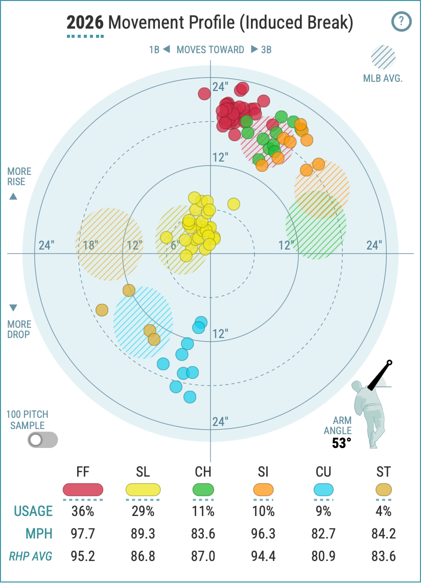
For all the bells and whistles, these charts show one thing, and context for it. The dots plot the induced break on a pitcher’s different offerings — or, the movement generated by the pitcher’s actions, not by gravity. The center of the chart, the intersection of the axes, represents how the ball would move with nothing acting upon it except gravity. Everything is shown from the pitcher’s point of view, so the directions match what you’d intuit from watching the classic TV angle from center field.
The shaded cloud areas show what’s normal in the major leagues (for a pitcher who throws with the same hand). While the axes might seem annoyingly theoretical, the clouds are as comparative as the pencil marks tracking kids' heights on the door frame. This fastball moves that way more than the usual MLB right-hander’s fastball.
So let’s look at one pitch, Dylan Cease’s four-seam fastball, and see what the chart tells us.
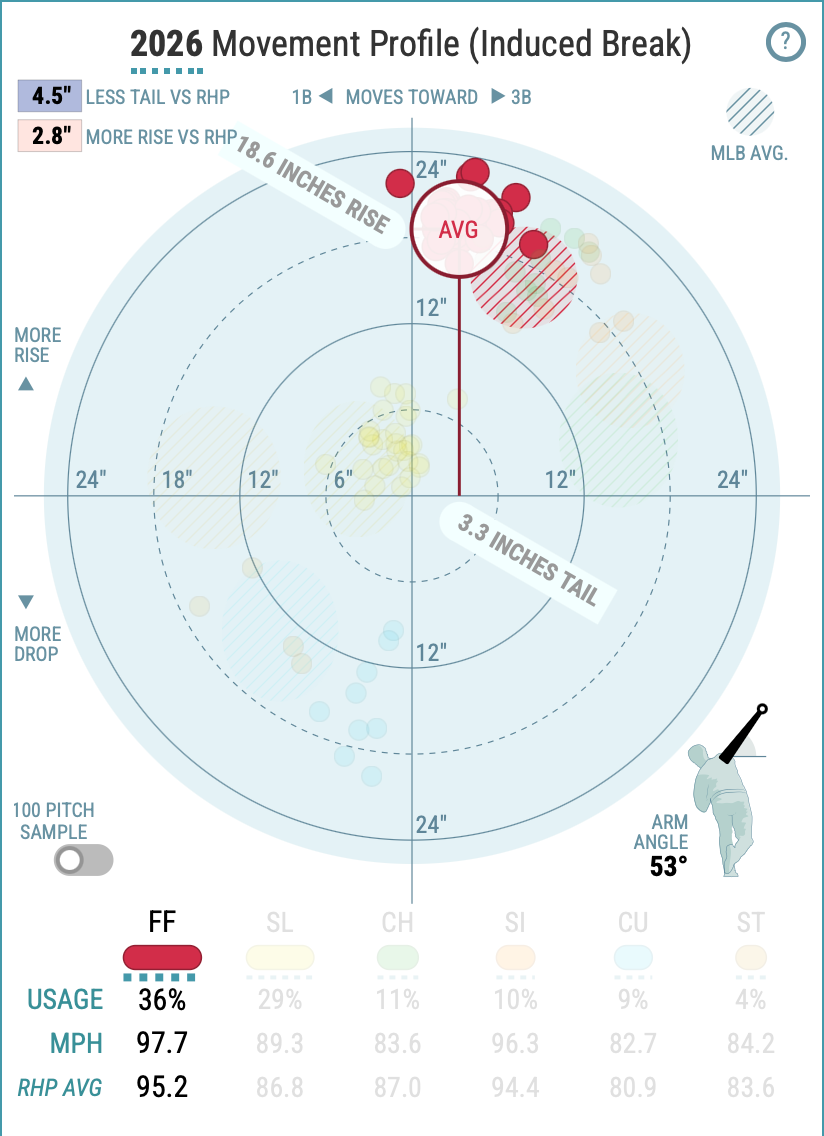
All pitches are actually falling as they fly toward the plate, of course, but those dropping less than our well-trained brains would expect have “rise” or vertical movement. Cease’s resists 18.6 inches worth of the usual gravitational effects. That is a very high number among MLB pitchers, so you see that his red dots stretch higher on the chart than the red cloud of typical fastballs. He also cuts his fastball more than the usual right-hander, so it stays more true than a hitter might expect, with his dots staying to the left (or glove side) of the red cloud.
Put those traits into action, and Cease often gets hitters to whiff by swinging underneath the heater. A pitcher whose fastball plot lives inside the cloud of the usual, like Miles Mikolas, is going to have a harder time getting whiffs.
Elsewhere, we can see that Cease’s changeup and curveball are seriously divorced from their corresponding norms.
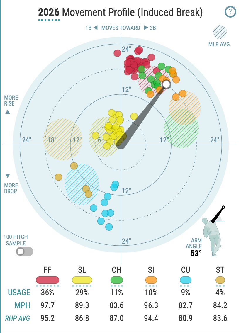
Considering his super-high arm angle, a portrait begins to emerge. Cease generates big up-and-down movement by coming straight over the top, and generally doesn’t get his pitches to move side-to-side as much as the batter would expect.
This is how Cease works, and this season it’s working to great effect.
⚾️⚾️⚾️
In a recent primer that pronounced Twins starting pitcher Joe Ryan one of the most appealing potential prizes of the trade deadline, ESPN’s Jeff Passan invoked the pitch movement plots for a mainstream audience.
“Ryan gets a strong separation of his arsenal — four-seamer, two-seamer, splitter, slider, sweeper and curve — covering basically all of the possible spots on a pitch movement graph,” he wrote. “This is the highest evolution of a pitcher combining deception/angles/deep pitch mix.”
And it’s true — I’ve written about Ryan as a way of explaining the power of pitch shapes and angles. Still, that’s heady stuff if you haven’t been mainlining FanGraphs and Baseball Prospectus or Lance Brozdowski’s work or MLB.com’s Statcast work or … yeah, this newsletter. The ethos of measuring and untangling and manipulating pitch qualities is deeply ingrained in the sport now.
Pledge your support to keep The Bandwagon going in 2026
The end goal, or perhaps temptation, is to shepherd and separate an unruly reality into value judgments. That manifests itself in metrics like Stuff+ and StuffPro and their offshoots that ingest all this information and determine — more expediently than actual games can, in theory — which pitchers are good, which ones aren’t, and which ones should be better. (Fun fact: If you blearily type “Stuff+” into the FanGraphs search bar and hit enter, you go to the player page of Stuffy McInnis, a first baseman born in 1890. Baseball enjoyment comes in many flavors.)
These metrics place emphasis on how successful the pitches should be, based on the intricate details of their trajectories, in comparison (or contrast) to how successful they actually were. Like Fielding Independent Pitching, expected batting average and, yes, Rorschach’s humble inkblots, it’s an attempt at measuring process.
The trouble with that, of course, is often trust.
Former front office staffer Lewie Pollis recently grappled with his queasiness over the arsenal metrics, calling them "black boxes" while acknowledging that he is perfectly comfortable referencing WAR for fans who couldn’t begin to calculate it.
“The inputs must be measured and tracked digitally — not numbers you could jot down in your scorebook," Pollis wrote. "The outputs come from machine-learning models and must be translated into formats fans would recognize. Surely comprehensibility counts for something.”
The colorful dots and clouds don’t inspire immediate recognition for many baseball fans in 2026, but that can eventually be a point in their favor. They do allow for investigation, for comparison.
To Pollis’ point, talking to a brick wall feels like a rational response when an arsenal metric says that Reid Detmers (ERA: 4.13, a long wistful sigh of a reputation) has better stuff and the same location abilities as Yoshinobu Yamamoto (ERA: 2.49, reputation of perpetual excellence). It’s not that it’s inherently wrong; it’s that you don’t have enough of a view into the information to have a conversation about it.
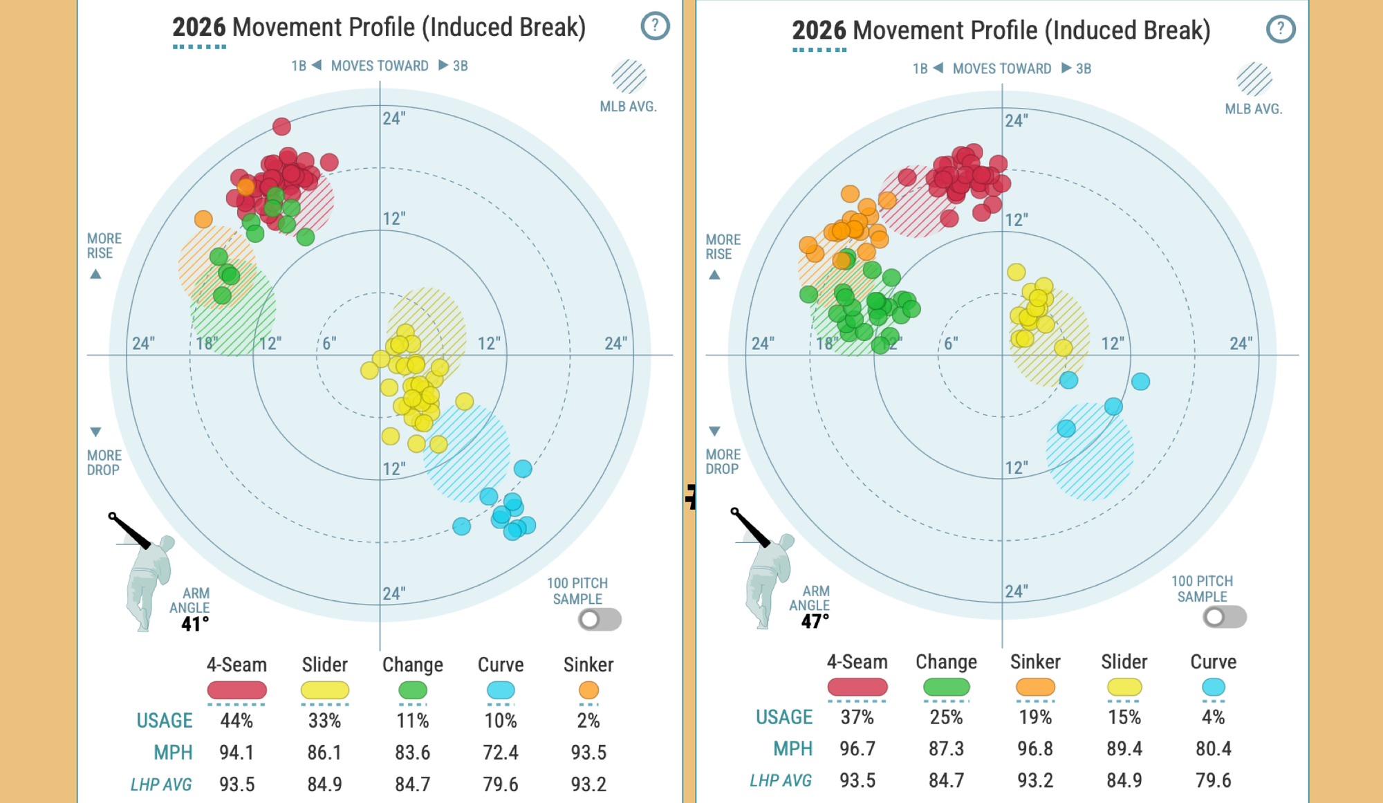
But compare Detmers, the tantalizing Angels lefty who might finally escape for greener pastures via trade this summer, to deadline headliner Tarik Skubal. Frame it in your hands like an architect in a movie.
It’s not the same house, but it’s built on the same foundation, already working pretty well in the majors. You can see why a savvy pitching coach and front office might look at Detmers and say, “We could work with this.”
Archetypes start to appear. There’s the rainbow arsenal of crafty artisan starters, like Cleveland rookie Parker Messick.
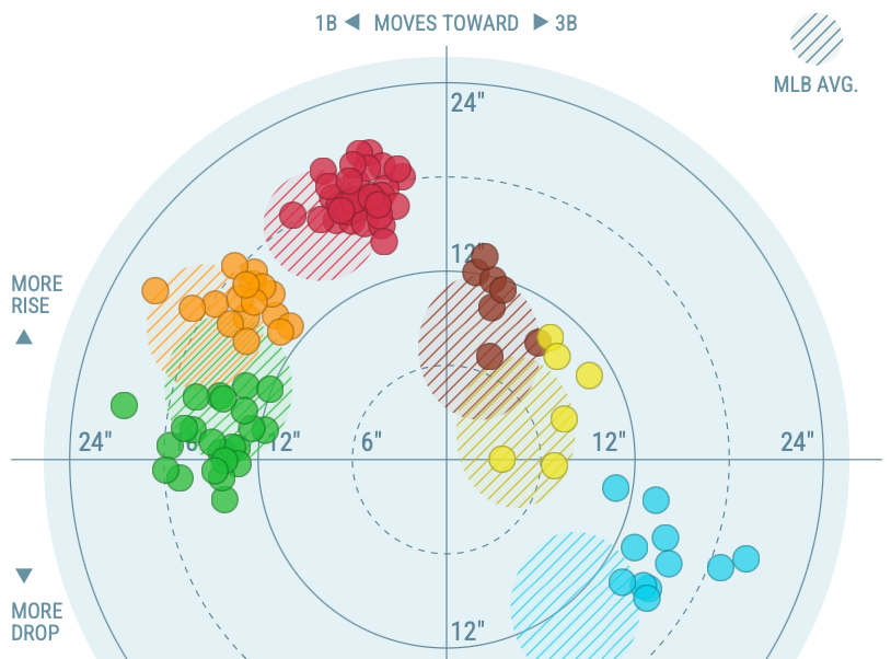
See that? At any given moment, he could throw something at virtually any horizontal angle — from veering left to making a hard right. You’ll find similar plots up in Boston, where Ranger Suarez and Sonny Gray deploy similar menageries.
You can eye Jacob Misiorowski’s turbocharged fastball-slider chart, and then glance back at peak Jacob deGrom and hope.
There’s a way of looking at these charts that makes it feel like, with the right Ouija board or cipher or sequence of buttons pressed, you might solve pitching. If your dream is to work in a major-league front office, maybe that's a productive lens.
But a more fulfilling way to see them might be as machine-assisted appreciation: Impressionistic flash cards of a pitcher. Inkblots that evoke something beyond an answer or an assessment, something in the observer. Images that refer back to something more visceral, that might let those fleeting fractions of a second linger a little longer. ⚾️
Thank you for reading, and for being a fan. I want to take a moment to humbly say that more support is needed keep the newsletter going strong.
If you’re able, please consider pledging a contribution to power The Bandwagon. I’ve knocked annual Fan status down to just $36.
You can also make a one-time contribution in an amount of your choosing.
I don’t want this to be a one-way relationship either. Now halfway through Year 2 of the newsletter, I’d love to know what you think — what you like, what you don’t and what you might like to see more of. You can take The Bandwagon Fan Survey and provide feedback here.